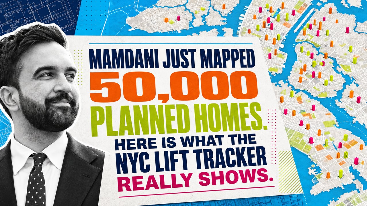
New York City just put one of its largest housing pipelines on a public map.
On July 30, Mayor Zohran Mamdani released the Land Inventory Fast Track Tracker, known as LIFT. The interactive tool shows more than 100 city owned sites where the administration says more than 50,000 homes could be created.
That is the headline.
The map tells a more important story.
A review of the current tracker shows 120 projects representing 50,970 planned homes. Only 15,212 of those units, about 30 percent, are attached to sites marked as having completed public approval.
The remaining 35,758 units are earlier in the process.
Some are waiting for a developer. Some are in an active request for proposals. Some have a development team but still need public approval. Some are large neighborhood plans that will take years to finance, approve, and build.
This does not make the tracker weak.
It makes it useful.
For the first time, New Yorkers can see the pipeline in one place and track whether a site moves from a public announcement to an actual home.
The City Identified Twice the Housing Required by the Original Order
Mamdani created the LIFT Task Force through Executive Order 4 on his first day in office.
The order directed city agencies to review publicly controlled property and identify sites capable of supporting at least 25,000 homes over the next decade.
That identification deadline was July 1. The public tracker arrived on July 30.
The tracker clears that threshold.
Its current total is more than double the original target.
That matters because New York is not short on government owned property. The city owns or leases more than 15,000 properties covering an area roughly the size of Brooklyn.
The problem is that most of the land is already doing something.
Parks, schools, hospitals, firehouses, offices, sanitation facilities, libraries, maintenance yards, and public housing occupy the majority of the portfolio. According to the tracker, less than 2 percent of city property is truly vacant.
Even that number overstates what can be developed.
Some vacant parcels are underwater. Others sit in wetlands, have difficult topography, or are too small or irregular for efficient residential construction.
The city did not find 120 empty lots waiting for apartment buildings.
It identified 120 complicated development opportunities.
That is a very different proposition.
The 50,000 Home Number Is a Pipeline, Not a Completion Report
The tracker divides projects into several stages.
The largest group by site count is the 65 projects marked as having completed public approval. Together, they represent 15,212 homes.
Another 28 projects, totaling 15,081 units, have a developer selected but have not completed public approval.
Twenty one projects, representing 16,935 units, are still before the request for proposals stage.
Four projects with 1,540 units have an active request for proposals.
Two projects representing 2,202 units are listed as being before public approval.
The math is clear.
Almost 70 percent of the units on the map have not reached the tracker’s final approval category.
That does not mean they will fail.
It means the 50,970 unit total should be understood as capacity in motion, not housing ready for occupancy.
New York projects can spend years moving through environmental review, community engagement, land use approvals, financing, permitting, construction, and lease up.
The administration says its new approval reforms can remove as much as two years from that timeline. Its SPEED reforms are designed to shorten predevelopment, permitting, and lease up. The city has also introduced an expedited land use review process and a faster developer selection program for certain affordable housing sites.
Those changes could matter.
The map will show whether they do.
Five Projects Carry More Than One Third of the Entire Pipeline
The tracker is broad, but the unit count is concentrated.
The five largest projects represent 18,700 homes, nearly 37 percent of the entire mapped pipeline.
The largest is the Brooklyn Marine Terminal, with 6,000 planned homes. The project is still listed before the request for proposals stage. Its broader vision includes a modernized port, public space, commercial and community uses, and at least 2,400 permanently affordable apartments, according to NYCEDC.
Next is 100 Gold Street in Lower Manhattan, with approximately 3,700 planned homes. A developer has been selected, but the project has not completed public approval. The current plan calls for mixed income housing with at least 25 percent permanently affordable, plus a new older adult center and public realm improvements. NYCEDC expects the project to enter public review in 2027.
The Fulton and Elliott Chelsea Houses plan represents another 3,500 units. The former Flushing Airport site in Queens adds 3,000. North Shore Housing on Staten Island adds 2,500.
If those five projects advance, they can reshape several neighborhoods.
If one or more stall, the citywide total changes quickly.
That concentration is why the tracker should be judged project by project, not only by its headline number.
These Are Not 50,000 Fully Affordable Apartments
The city describes LIFT as part of its affordable housing strategy.
That is accurate.
It does not mean every home shown on the map will be income restricted.
Several of the largest projects are mixed income developments. Brooklyn Marine Terminal is planned with at least 40 percent permanently affordable housing. The current 100 Gold Street plan requires a minimum of 25 percent permanently affordable housing.
Other sites are intended to be entirely affordable.
The New Utrecht Library redevelopment in Bensonhurst is planned as a new library with 100 percent affordable housing above it. Sol on Park at the Morris Houses in the Bronx will provide 229 deeply affordable senior apartments, including 80 reserved for current Morris Houses seniors.
The tracker combines these different models into one total.
That is not a flaw.
It is a reason to read past the number.
The real questions are how many apartments each project produces, how many are permanently affordable, which income levels they serve, what public uses must be replaced, and how much subsidy is required to make the development work.
Those details decide whether a project addresses the housing shortage in theory or affordability in practice.
This Pipeline Did Not Start on January 1
The tracker should not be read as 50,970 homes created from scratch by the current administration.
Several of its largest projects were announced or advanced before Mamdani took office.
The Brooklyn Marine Terminal vision was approved in 2025. A developer was selected for 100 Gold Street in December 2025. The former Flushing Airport plan was announced in July 2025.
The tracker’s technical appendix confirms that its project list draws from the city’s existing Public Pipeline Transparency Report and public press releases.
Mamdani did not originate every dot.
His administration put the dots into one public system, added new sites, and attached the pipeline to a larger commitment.
That distinction matters.
Credit for an announcement is not the same as responsibility for delivery.
The tracker gives this administration responsibility for what happens next.
The Most Interesting Sites Are Not Always Vacant
Some of the strongest opportunities involve combining housing with an existing public use.
The New Utrecht Library project is one example. The city can replace an aging library and build hundreds of affordable homes on the same site.
The Bloomingdale Library and Riverside Health Center site on the Upper West Side is another. Any redevelopment must preserve health services in the neighborhood and include a new library in the future residential building.
This model can unlock valuable land in established neighborhoods where vacant parcels barely exist.
It can also become expensive and politically difficult.
Public services must continue during construction. Agencies may need temporary locations. New facilities must be designed and funded. Communities will scrutinize height, density, affordability, traffic, and service delivery.
The land may be publicly owned.
The development is not simple.
That is why the tracker’s future updates matter more than its launch.
What the Map Changes for Developers
For affordable housing developers, architects, builders, lenders, and community organizations, the map is an opportunity list.
It shows where the city expects to issue new requests for proposals, which agencies control the projects, and how far each site has moved.
The administration says it will release requests for proposals for at least five new sites every year over the next four years.
That creates a visible pipeline of public work.
The city has also committed $22 billion to affordable housing over five years, including nearly $5 billion in capital funding for new affordable housing over the next two years.
Capital is necessary.
Execution will still depend on land use approvals, subsidy availability, construction costs, insurance, labor, interest rates, and operating economics.
Public land removes the private land acquisition cost.
It does not remove the rest of the development stack.
What Buyers, Owners, and Investors Should Watch
Large public projects change more than the affordable housing count.
They can create new retail corridors, parks, libraries, community facilities, streets, and infrastructure. They can add thousands of residents to a neighborhood. They can also introduce years of construction and reshape future supply.
Property owners near the largest LIFT sites should track four things.
First, watch when a project moves into public review. That is when the plan becomes more specific and the neighborhood conversation becomes real.
Second, watch the final unit count. Early capacity estimates often change as design, zoning, infrastructure, and financing are tested.
Third, watch the affordability mix. A project with 25 percent affordable housing creates a different market impact from one that is entirely income restricted.
Fourth, watch the public improvements. Parks, transit access, schools, libraries, and waterfront investment can matter as much as the housing itself.
The map is not a forecast of immediate inventory.
It is an early signal of where public investment and future development may concentrate.
For more current New York market and policy analysis, visit the Nile Lundgren real estate blog.
The Map Creates a Public Scorecard
Housing announcements are easy.
Housing delivery is not.
Before LIFT, many of these projects lived across separate agency pages, planning documents, public reports, and press releases. That fragmentation made it difficult to understand the full pipeline or follow individual sites.
Now each delay has an address.
Each approval has a status.
Each major unit count can be checked against what eventually gets built.
The city says the tracker will be updated as new projects are announced and existing projects advance.
That promise is important.
A map that remains current becomes a public scorecard.
A map that stops changing becomes another announcement.
The Bottom Line
The NYC LIFT Tracker is one of the clearest public views New Yorkers have received into the city’s housing plans for publicly owned land.
It currently identifies 120 projects and 50,970 potential homes across all five boroughs.
That is meaningful scale.
It is not 50,970 completed homes.
Roughly 70 percent of the projected units remain in stages before completed public approval. More than one third of the entire pipeline sits inside five major projects. Some developments will be entirely affordable. Others will be mixed income. Several began under the prior administration.
The map does not solve those complications.
It makes them visible.
That is the real value of LIFT.
Mamdani has put the housing promise on a public map.
Now the market, the neighborhoods, and every New Yorker can watch whether the dots become doors.